No visibility
Referrers didn’t know whether a referral had been received, was being processed or had been paid.
 You’re here Reviba demand tests Heat pump: 362 leads, 5× baseline
 You’re here Alumo subscription portal 250 leads, 44% of all enquiries
 You’re here Alumo referral rewards 1,030 repeat referrers analysed
 You’re here fngrprnt Founder · brand and web design
 You’re here Still Here (opens Behance in a new tab) Clarity, trust and ease
Case study 03 / 04
The short version
Alumo’s cheapest way to win customers was leaking. People referred their friends and then heard nothing, and some stopped referring. I traced it to a matching defect, then redesigned the journey from the advisor conversation to payout, across a referrer portal and an office dashboard.
1,030
repeat referrers in the research segment
5
referral programmes studied
111
high-fidelity screens
2
products: referrer portal and office dashboard
01
The problem
I segmented the client database down to the 1,030 clients who had referred two or more people, the ones with the most experience of the programme. Then I sent them a short survey on WhatsApp, written around what they had actually done, not what they thought they might do.
Every respondent said they had to contact Alumo themselves to find out what was happening. Several said they had held back from referring again. For the cheapest acquisition channel Alumo has, that is a direct, measurable cost.
Referrers didn’t know whether a referral had been received, was being processed or had been paid.
When they did chase an update, the information they got was often inaccurate.
One referrer only heard about the portal from her advisor. When that advisor left Alumo, nobody picked up the thread.
Referrals were declined with no explanation. Some may have been made before the client was ready in Alumo’s system.
It was a small number of responses, so I treated them as strong directional signals rather than proof, and presented them that way.
One respondent felt the 1% reward should be far higher. That’s a business decision, not a flow problem, so I flagged it to the people who own the reward structure.
02
The root cause
I followed the complaints back through the system to a matching defect. When a referrer’s details didn’t line up exactly with the client record, the referral failed, and the referrer had no way of knowing.
Documenting the root cause meant the identifier could be fixed in the live portal on its own, before any redesign shipped.
In the redesign
03
The research
I studied how five established referral programmes handle status and payouts. Not just the marketing version: I went looking for the real friction in reviews and complaints, so we could avoid other companies’ mistakes as well as copy their successes.
Revolut’s weak spot mirrored ours almost exactly. The submission works, but nothing tells you anyone received it, so people fill the silence themselves.
How does the referrer find out it was received?
How is progress shown while it’s in process?
How clear is the payout, and when do they find out?
Where does it fall short, according to real users?
04
The flow
The findings and the research went to leadership. That session surfaced problems no screen could fix on its own: who owns the portal, a dependency on a third-party vendor and the payout logic. All three went into the redesign direction.
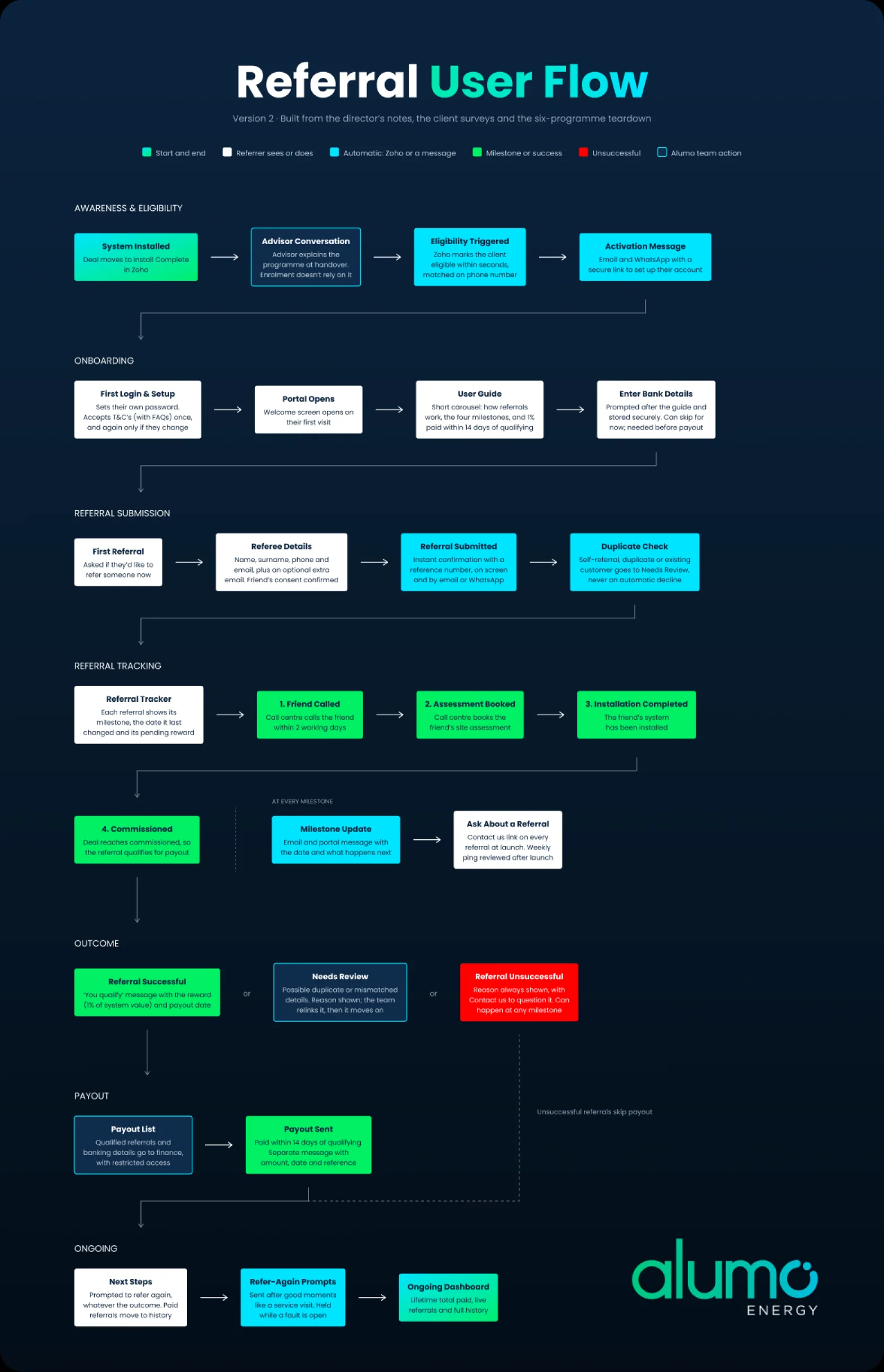
I mapped the current journey with its emotional low points, then reworked the full flow from the advisor conversation to payout, matched to the real Zoho pipeline stages and the identifier fix.
A clear decline state, so nobody is left guessing why a referral didn’t go through.
The programme no longer depends on one advisor remembering to mention it.
05
Agreed or to confirm
Every design choice had to trace back to a source: the meeting minutes, the programme terms or the research. Some rules were agreed. Others were still open business decisions waiting on the referrals admin and finance.
So I built a convention into the file. Agreed rules are solid. Anything still open sits in a dashed “to confirm” component, so a developer can never mistake a proposal for sign-off.
Agreed
To confirm
06
The referrer portal
A mobile-first website, designed screen by screen against the survey findings: every referral confirmed, every stage visible, every decline explained and the payout made obvious.
I built the design system from scratch first, with colours, type and spacing as variables and components for buttons, forms, navigation and charts, then used it for every screen. A handoff pass put everything on auto layout and tokens for the developer.
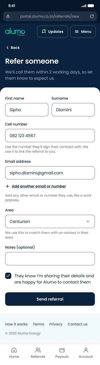
01 Refer someone
A short form, and the number is checked before it’s sent.
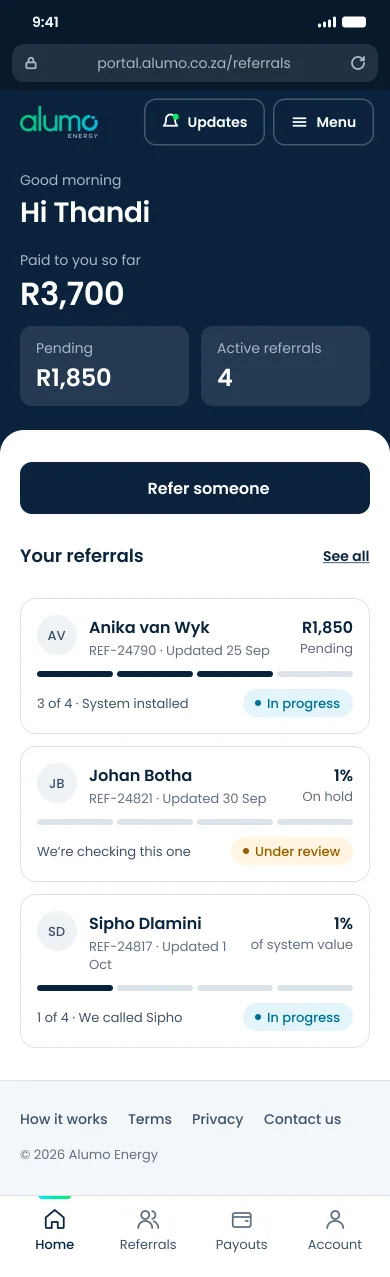
02 Home
Earnings and every referral’s status at a glance.
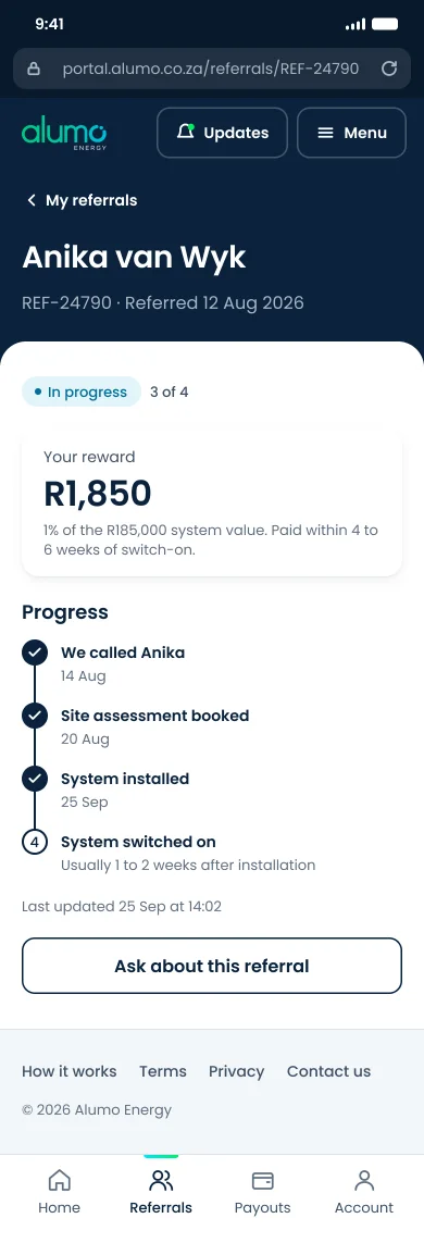
03 Referral detail
A tracker from sent to paid, with a way to ask a question.
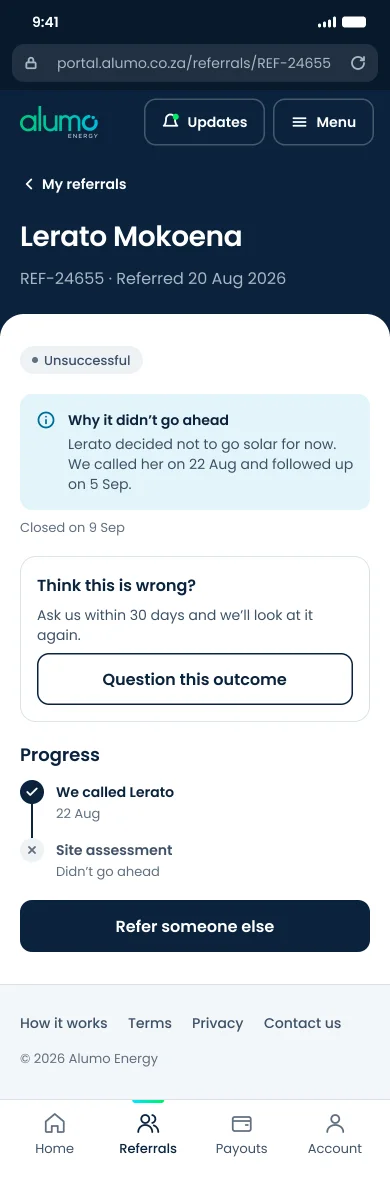
04 Unsuccessful
Always a reason. Never silence.
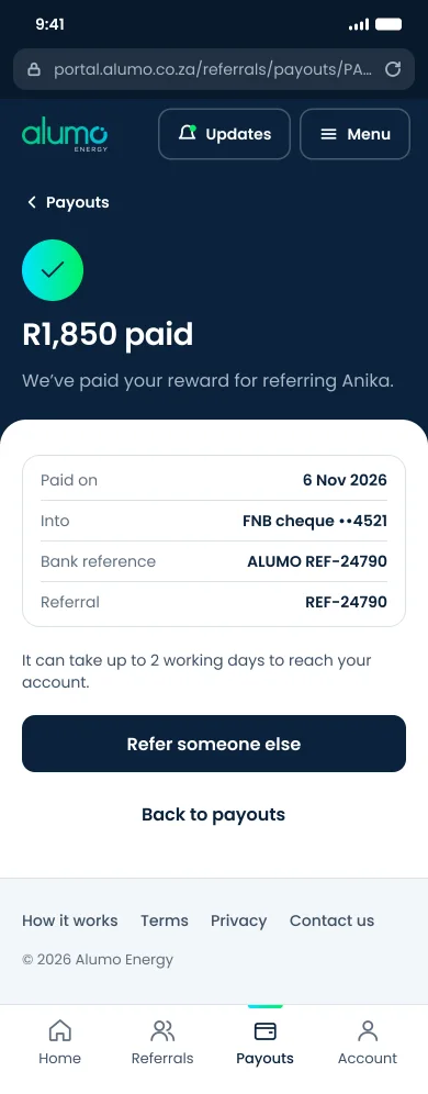
05 Payout sent
The peak of the journey, designed on purpose.
07
The office dashboard
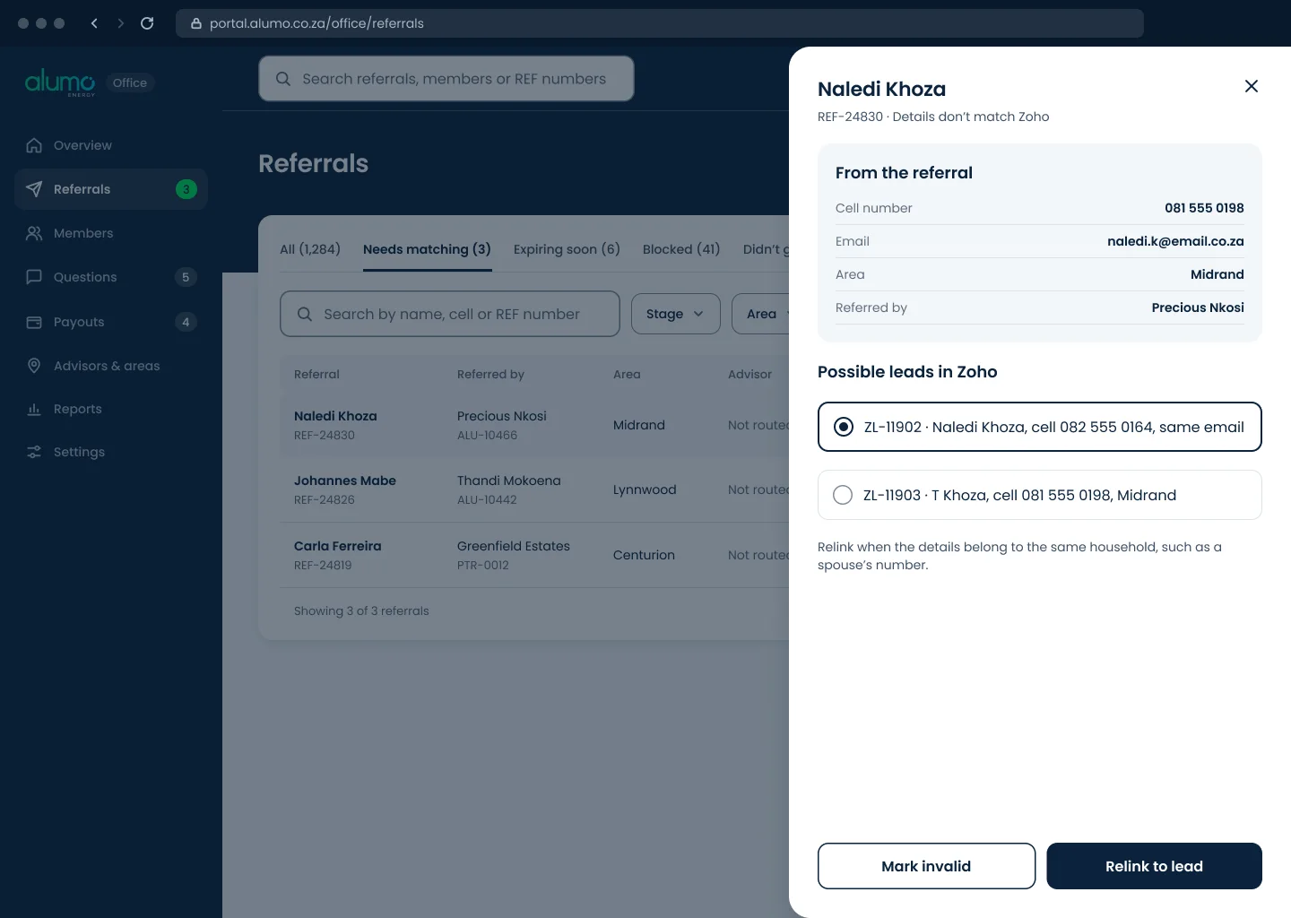
The referrals admin is the primary user. I critiqued the legacy admin tool against usability heuristics, then built the information architecture from her complaints and the meeting minutes.
Payouts follow the approval rules finance set, and referrals that break the programme rules are blocked with the reason on screen.
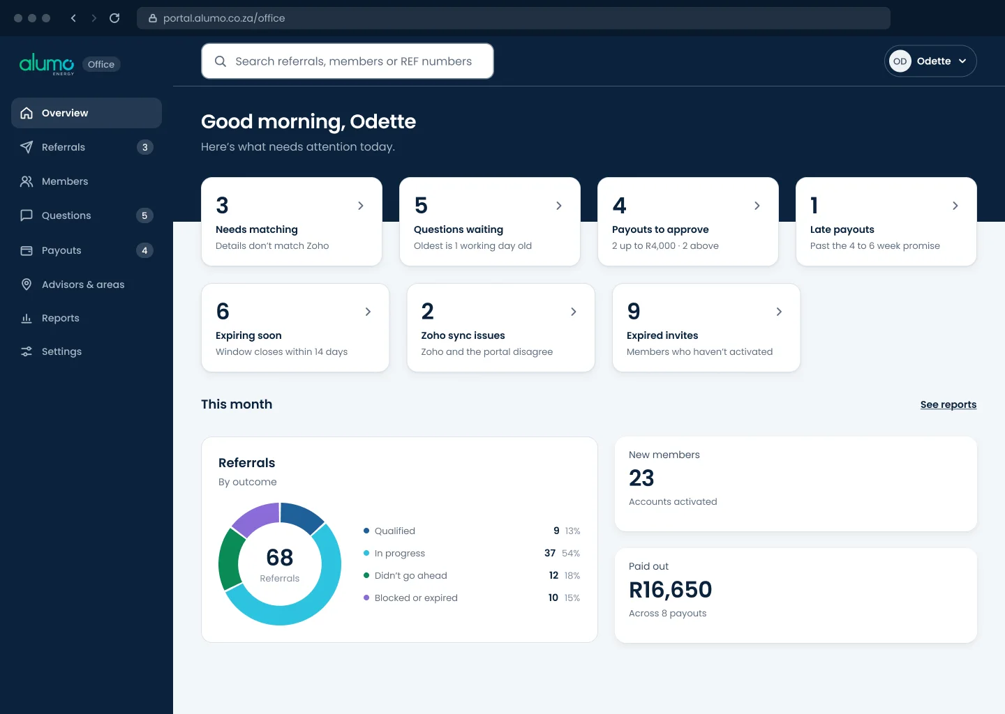
What needs attention today, before anything else.
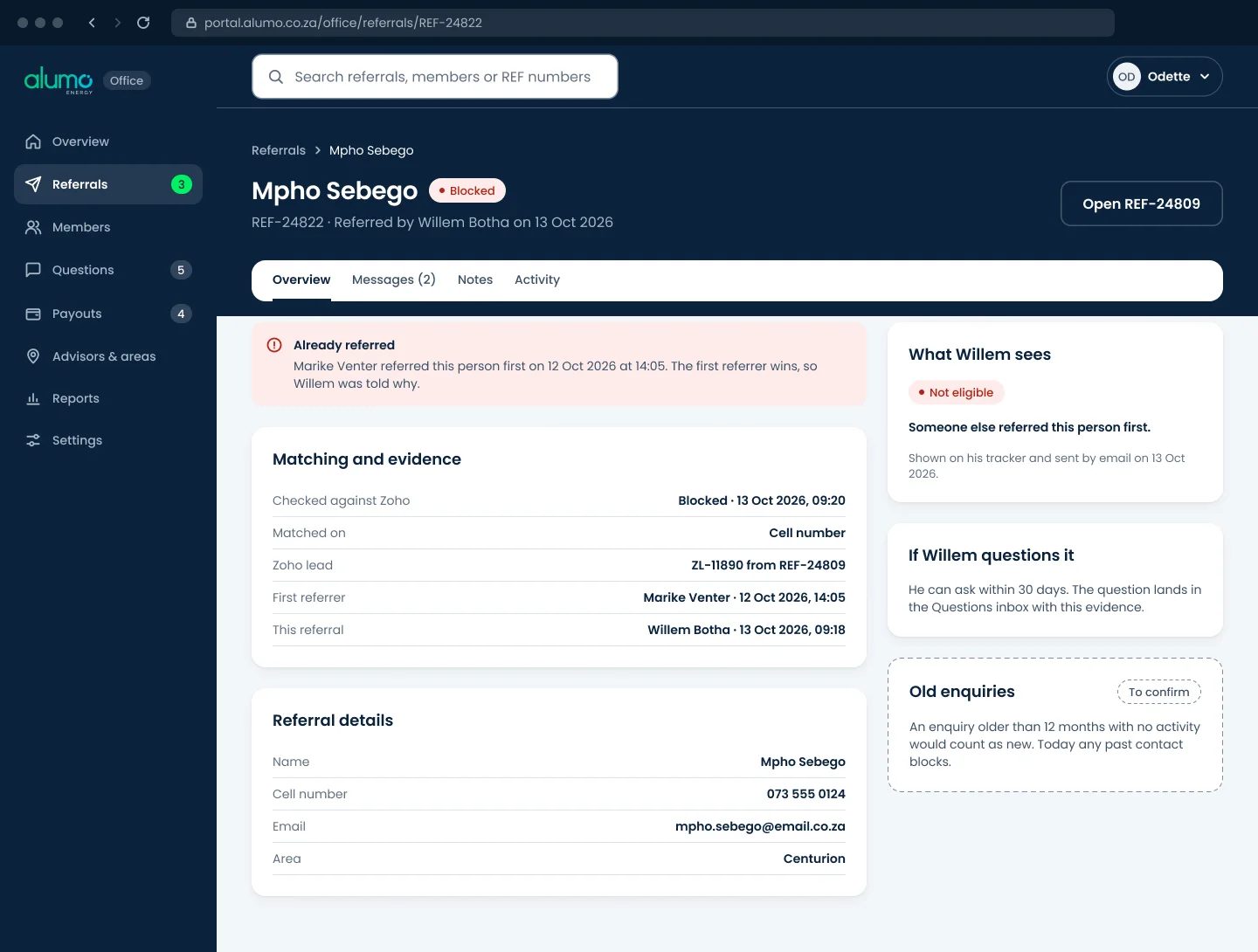
The rule that blocked it, shown on the record.
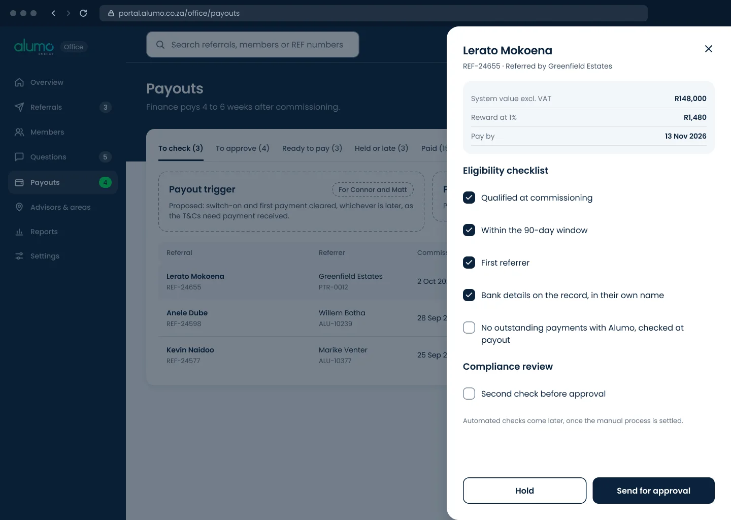
A checklist before anything goes for approval.
Where the old defect now gets caught and fixed.
08
Where it stands
Discovery alone produced a validated problem statement, a reusable research asset and a documented root cause that can fix the live portal on its own, whenever the redesign ships.
Next comes a prototype, usability testing and developer handoff. The survey respondents are already identified as the first test group, and the measure that matters is the share of Alumo’s leads that come from referrals.
Next case study · 04
fngrprnt
Read the case study →
Contact
Open to product design and UX roles, remote or in-house. The quickest way to reach me is email.
timothyenricomoses@gmail.com